Artists: Use the Color Wheel to Develop Color Harmony in Your Work
/
I teach painting workshops all across the country. I find that when I begin a discussion about utilizing the color wheel to develop color harmonies in paintings I receive lots of blank looks on student's faces. I have come to realize that nearly all amateur painters paint from photographs, trying to exactly match local colors without any thought given to creating harmonious color combinations. I guess they think that everything in a photograph provides color harmony. It doesn't.
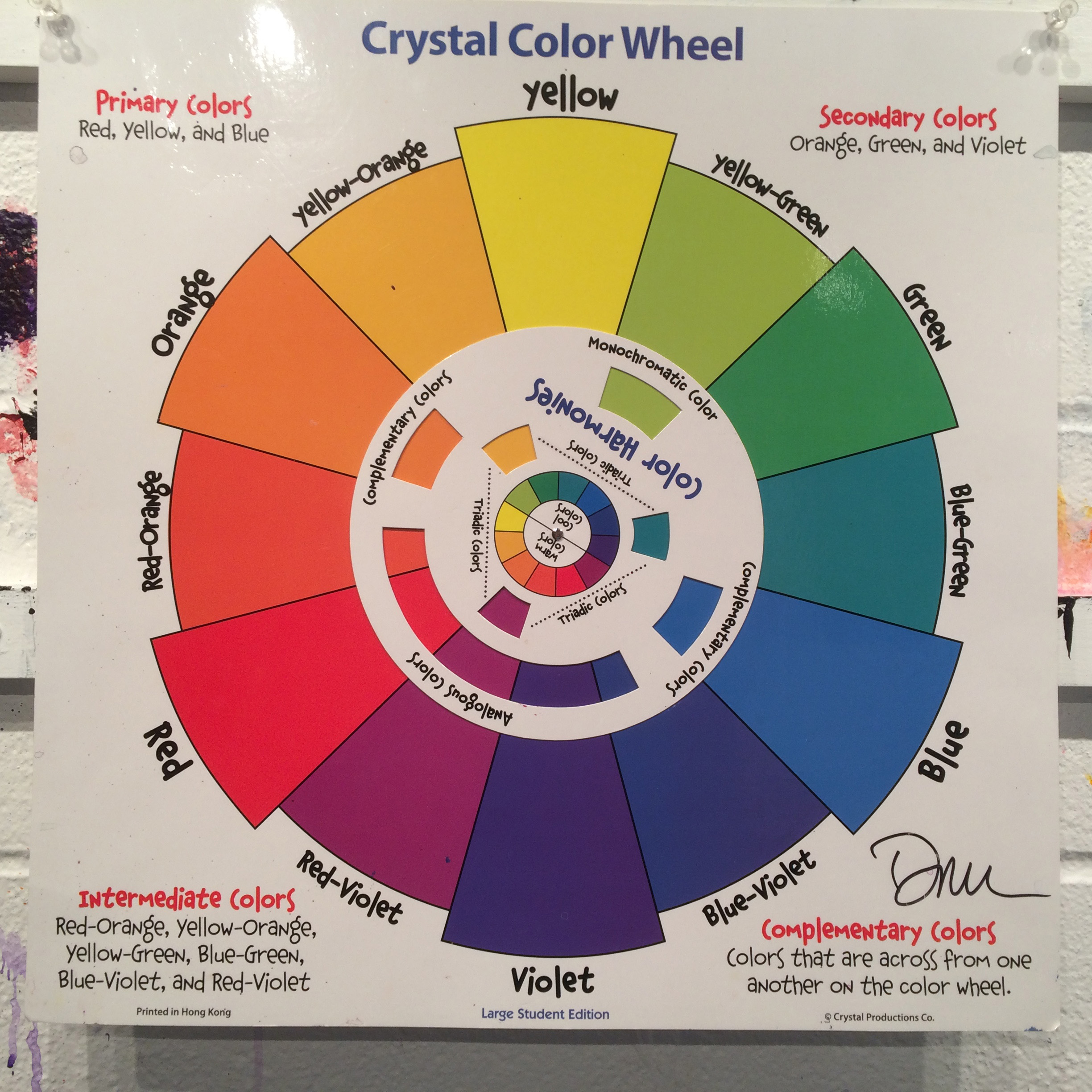
That is why it is essential to learn how to read, understand and implement the color harmony provided on the color wheel. I use a standard 12 color wheel - the most common found. I use the Crystal Color Wheel which is made for elementary school students - and that is exactly why I use it - it is very simple, clear and easy to use. It has a dial that turns to identify the major types of color combination typically used: monochromatic, complimentary, triadic and analogous. Most wheels purchased from art supply stores are horrible. They provide too much useless information that is confusing for amateur painters.
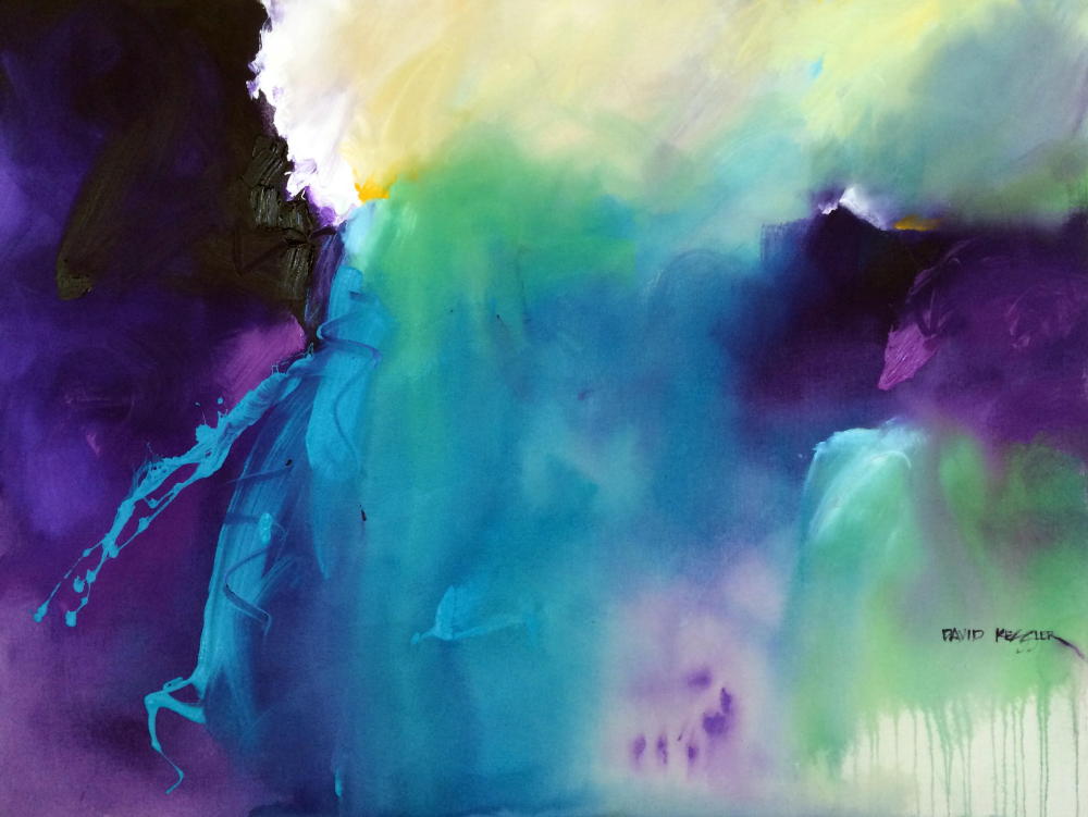
The great thing about the color wheel is that someone centuries ago figured out how all the colors worked together so today we don't have to. We just have to implement what is on it. The painting above, "Saltwater 1" was created using a typical triadic color combination of green, violet and orange. I always use the color wheel, at least as a starting point for a color combination. I know that by utilizing the information it contains that my painting colors will be harmonious when the painting is complete.
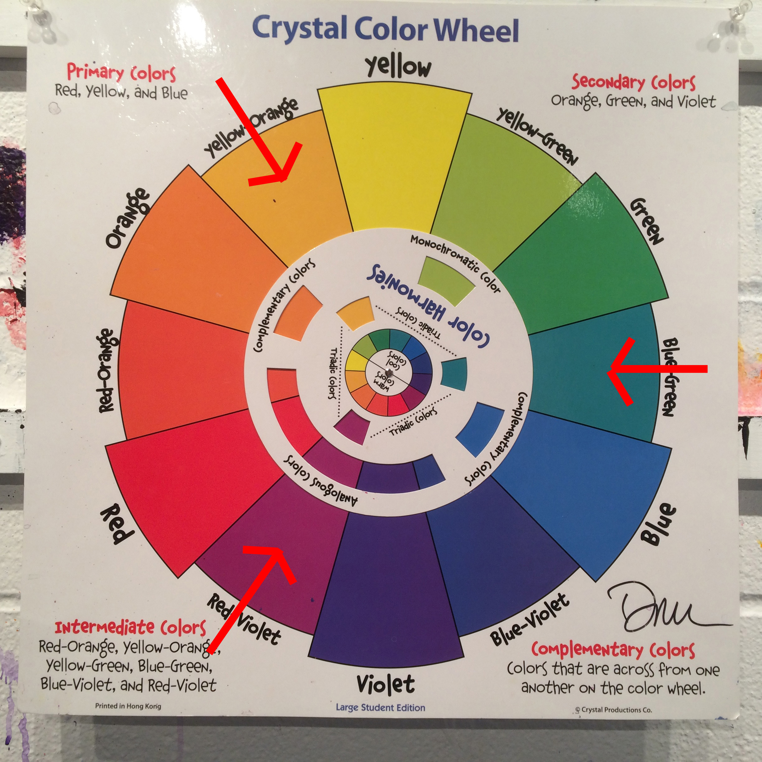
Let me provide a simple example of local color (the color of objects in real life or in a photograph) versus using the color wheel to create color harmony. I, like many others love sunflowers. I used to paint them often. The local color of sunflowers is green stems and leaves, yellow petals and brown centers. Green, yellow and brown is not a color combination found on the color wheel, but with just slight modifications we can make it work. Let's begin with green for the stems and leaves. If we turn the color wheel to a triadic color combination we see that green is included in a triad of green, violet and orange. Well orange will not work for our petals, so let's look for something closer to yellow. Looking at the color wheel image above I have turned it to a triad of yellow-orange, blue-green and red-violet. Now we have something we can work with. We can paint the stems and leaves blue-green, the petals yellow-orange instead of just yellow and the flower center as red-violet instead of brown. Now we have color harmony using the color wheel that we did not have using local color. Now all three colors will work together to energize each other and our retinas when we view them. This is a simple modification for maximum effect.

I always tell students that color cannot be learned from a book, and so it is with the color wheel. But it is a great tool to guide you as you develop your paintings. Color can only be learned by mixing colors together to see what happens. I make color charts by mixing every color with every other color to see what happens. This is, I believe, the best way to learn how colors interact. However the color wheel is the single best tool to utilize in understanding what colors are harmonious with other colors. Artists: use the color wheel to develop color harmony in your work.